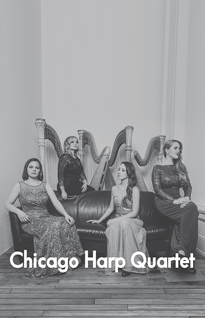


Chicago Harp Quartet. I like the constrast I got from the black and white outside, with the lush, savory, warm inside photo. The front cover, you might notice, is an odd-looking room: that's because I had to extend a photo that had them looking nice, but wasn't portrait orinented. As of my writing this, they seem to have a newer line-up, and as such, MUCH NICER RESOLUTION PHOTOS. (*wrings hands in agony*)


